Please scroll down to view my portfolio
Click here to download my resume
GIS Analysis
-
![]()
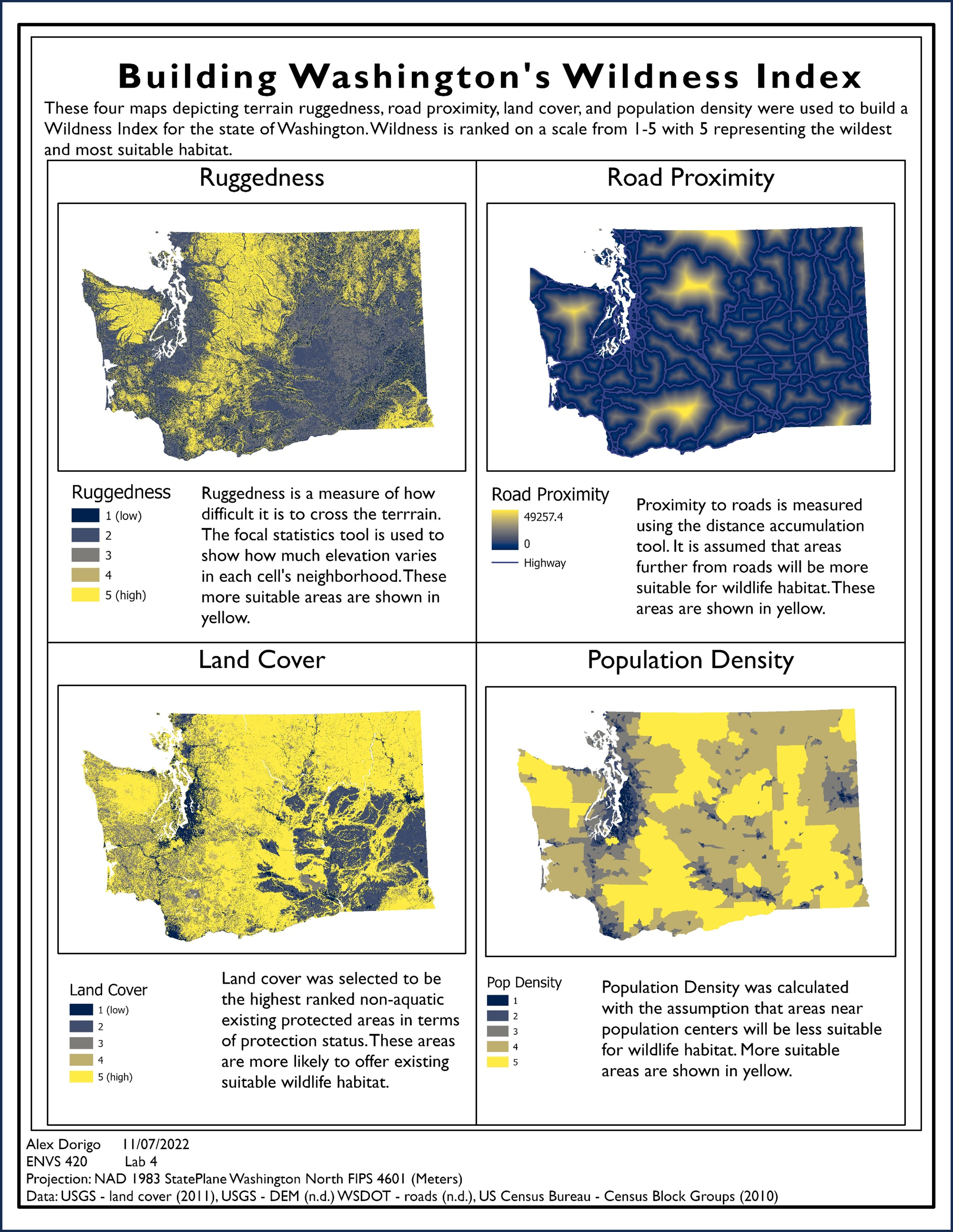
These four spatial data maps were used in combination to create a cost surface. Each of the four maps is detailed here explaining how they were created.
-
![]()
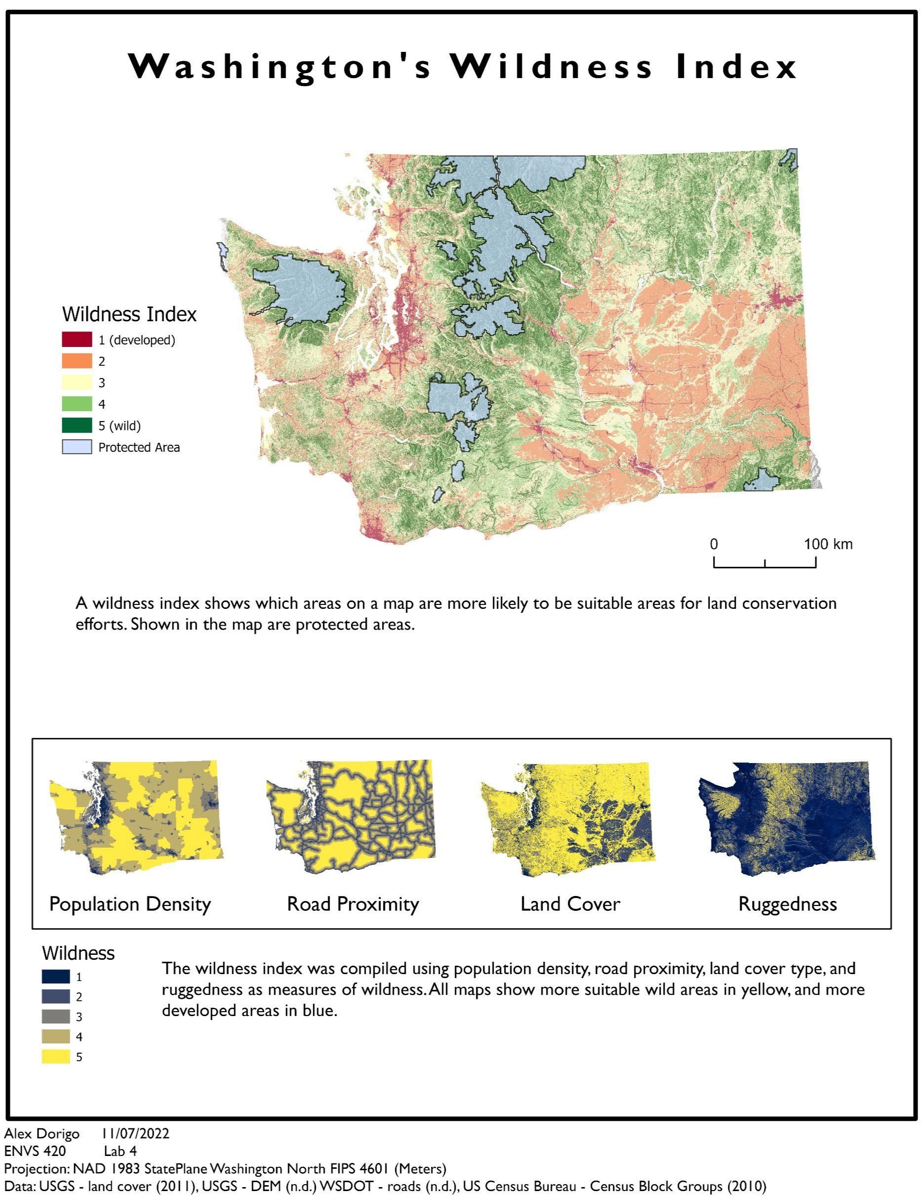
A cost surface was created using the four landscape variables of ruggedness, road proximity, land cover, and population density in Washington state. The cost surface was processed to analyze the optimal path that wildlife might use when traversing between protected regions in Washington. The goal of the project was to inform decision making about where wildlife safety corridors should be focused moving forward.
-
![]()
A cost-weighted map of optimal wildlife corridors was created using a cost surface, a map of euclidian distance, and a map of protected regions in Washington state. This final map details which areas wildlife are likely to use when traversing from one part of the state to another.
-
![]()
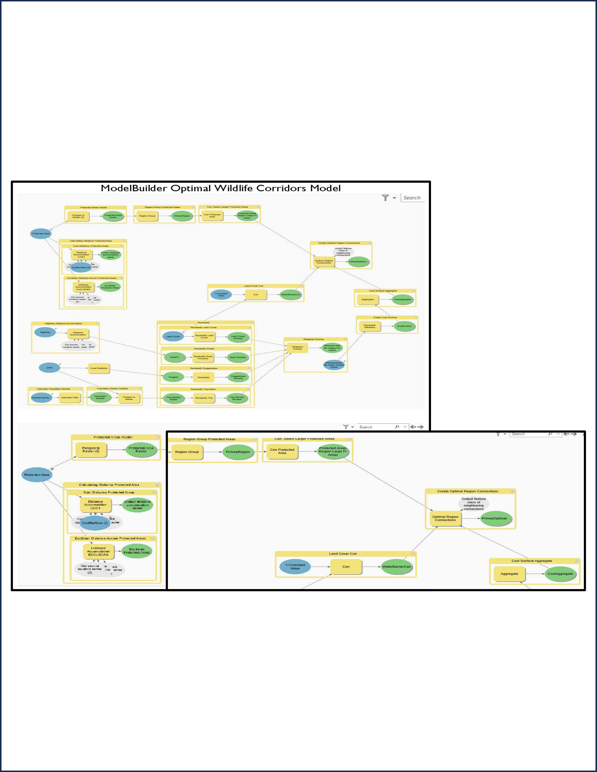
ModelBuilder model for wildlife corridor project.
Tools used in ArcGIS Pro: weighted overlay, create optimal region connections, cost surface aggregate, reclassify, distance accumulation, and optimal region connections.
-
![]()
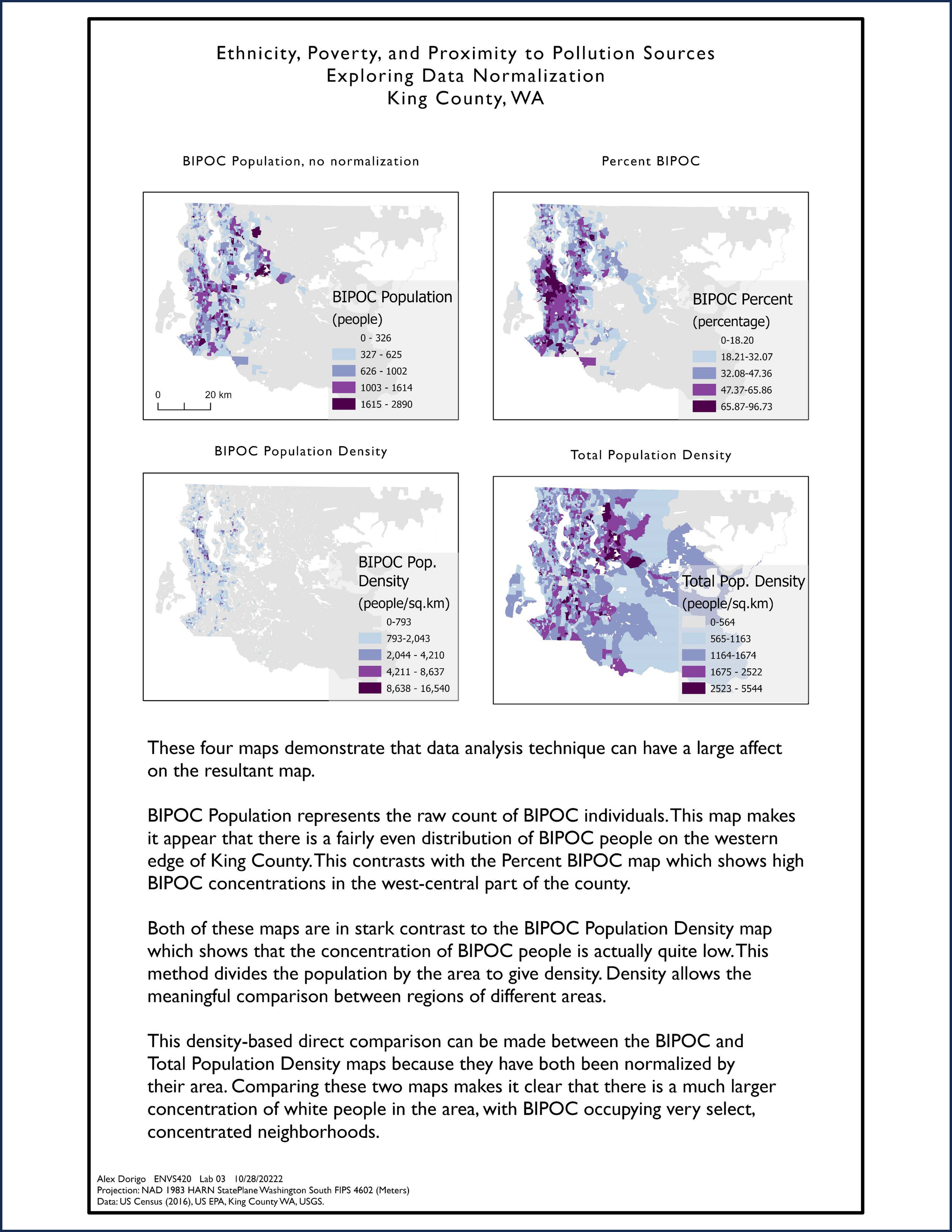
Comparing the populations living in poverty to the BIPOC population. These maps demonstrate that proximity to pollution correlates with being a person of color, not neccessarily just a person who survives below twice the poverty line.
-
![]()
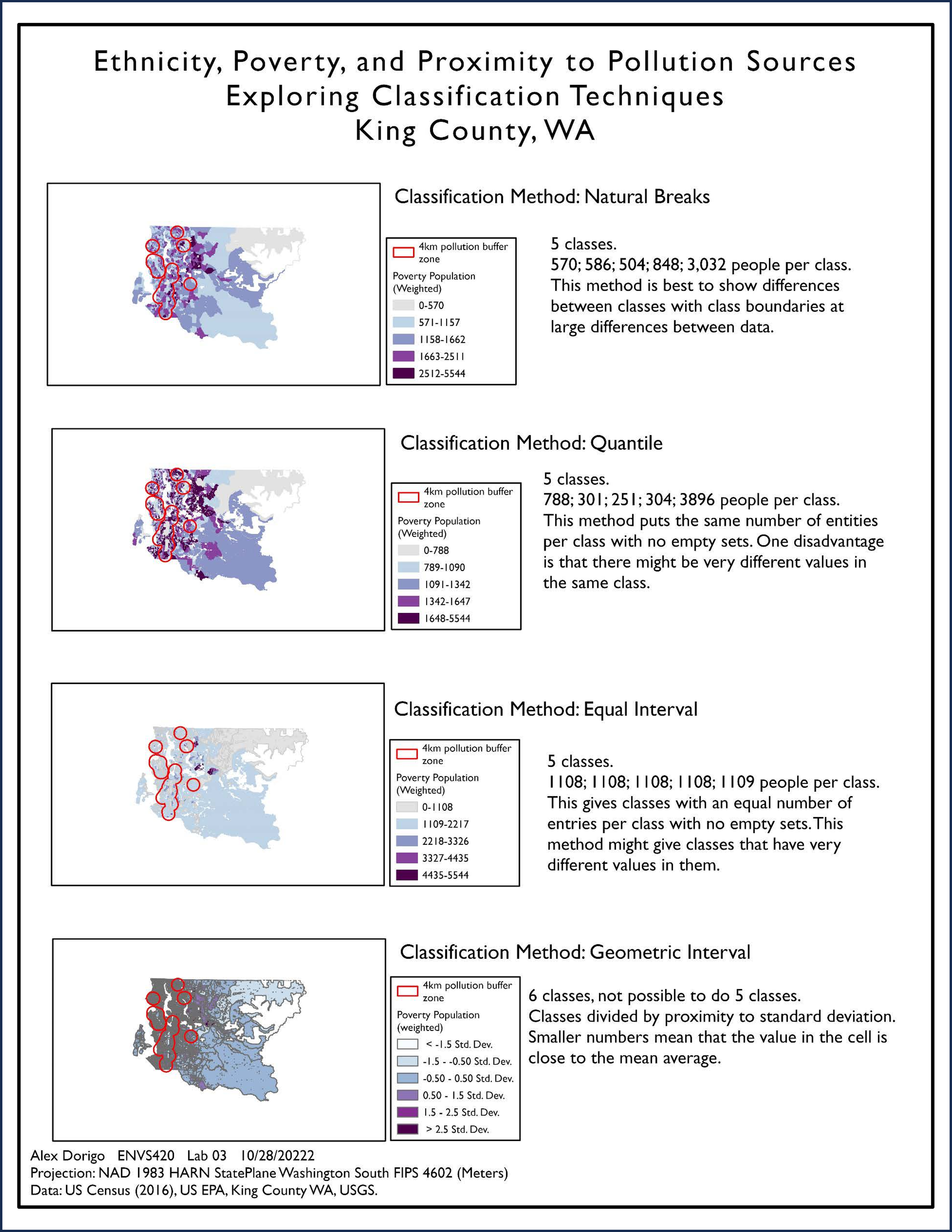
Maps detailing the proximity to pollution point sources using various qualification techniques.
-
![Four maps that show the visual differences between data normalization techniques]()
This project focused on various methods of classification including natural breaks, jenks, and quantile. This map shows that poverty is not the main predictor of the likelihood that a resident of King County, WA lives near a pollution point source, rather one’s ethnicity is a stronger predictor of this proximity to pollution sources. Historical red-lining in King County, WA is responsible for this discrepancy between the two population groups.
-
![ModelBuilder model of how the Data Normalization maps were created]()
ModelBuilder model for the Ethnicity, Poverty, and Pollution Proximity project created using ESRI’s ArcGISPro.
Tools used: join.csv, join.table, buffer, calculate weighted fields
-
![]()
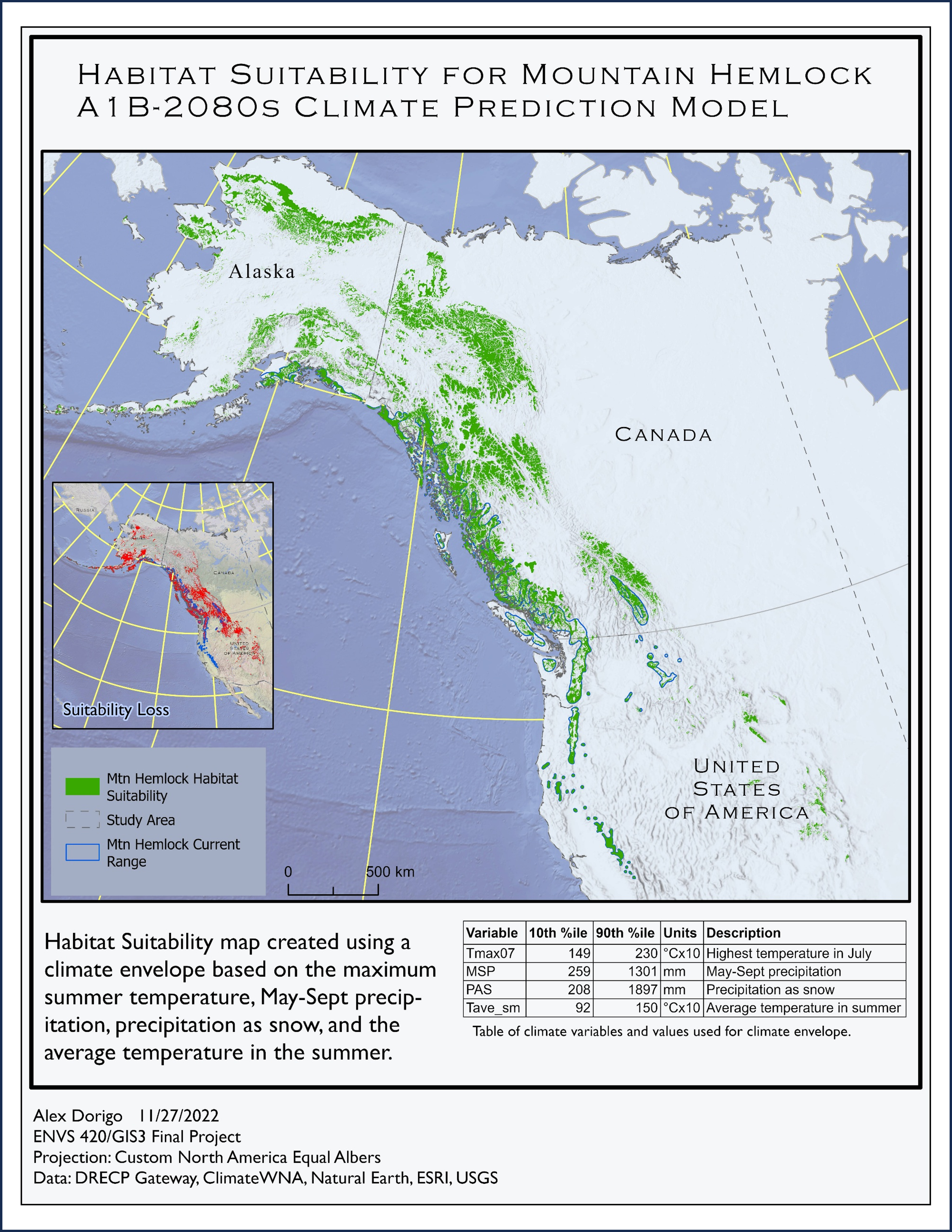
Using climate satellite data to create a climate envelope which predicts the habitat suitability for the Western Hemlock tree in the 2080s.
-
![]()
ModelBuilder model for iterating climate model rasters.
-
![]()
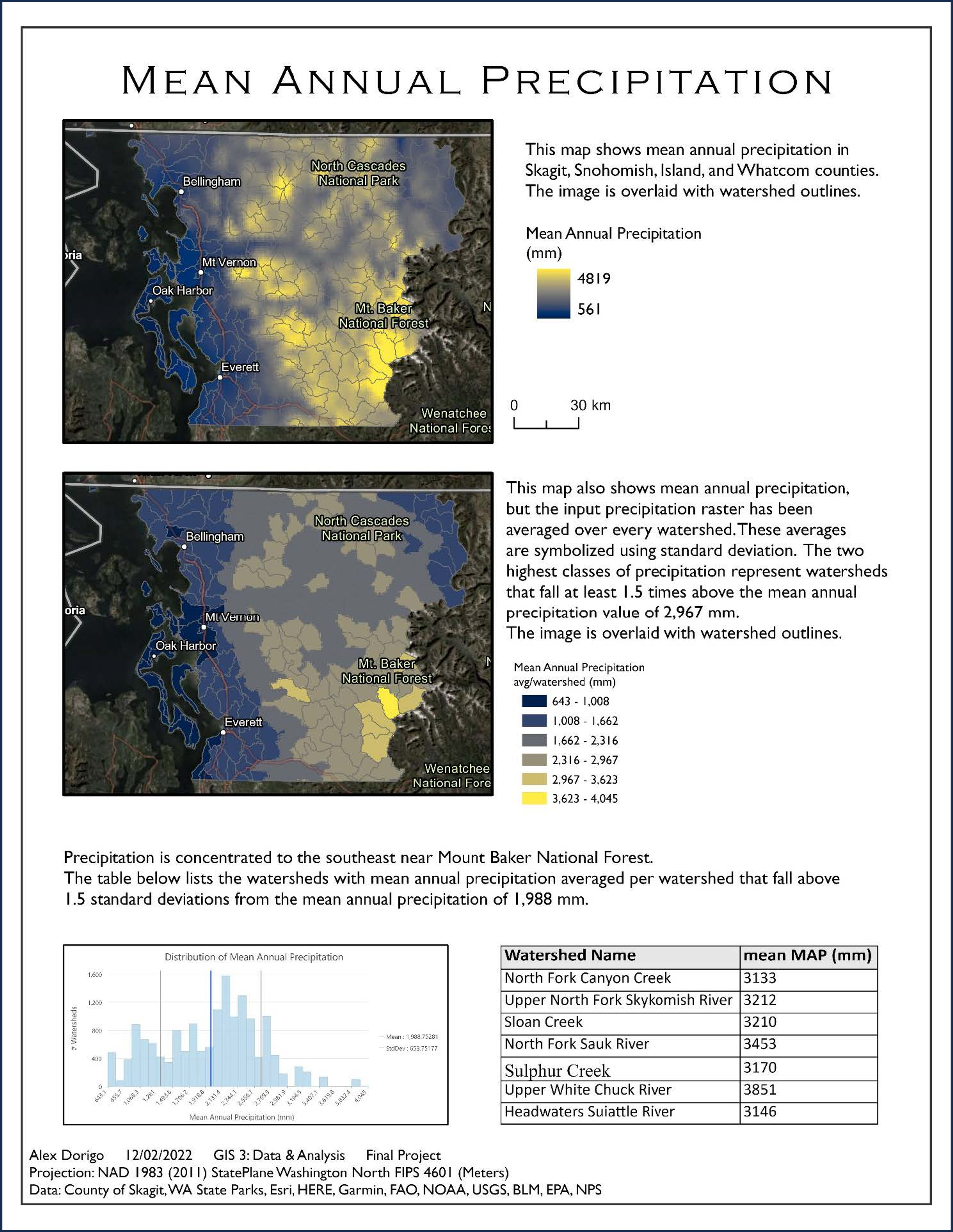
Two ways to visualize mean annual precipitation.
-
![Detailed map of Washington State showing goldmines within 5km of the Columbia River near the Colville and Spokane Reservations.]()
Sovereign Tribal Lands and Goldmines in Washington State


Remote Sensing
-
![Comet Rosetta Jets]()
Using remote sensing techniques to reveal light-colored jets coming off the comet Rosetta’s surface.
-
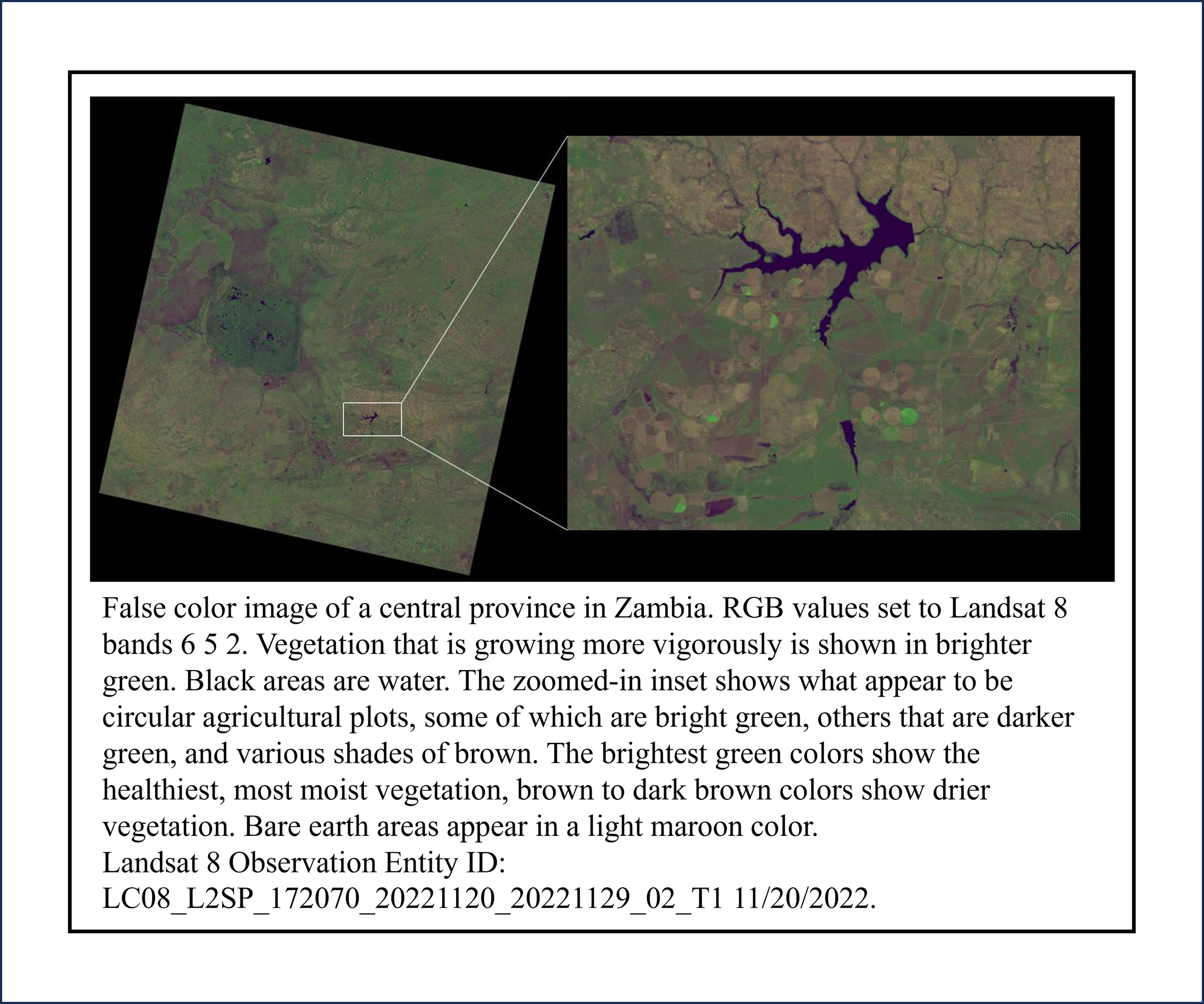
![Zambia maps]()
Using false color technique to reveal vegetation in various states of growth from raw LandSat data of a central province in Zambia.
-
![Kodiak Mesa]()
Using a stretch on all bands of satellite data for Kodiak Mesa on Mars, a false color image is created by restricting the histogram to the lighter shades. Geologic features are easier to see after performing this image manipulation.
-
![]()
A curve adjustment was made to the histogram to lighten the darker areas of the image without washing it out. This makes more details in the foreground visible.
-
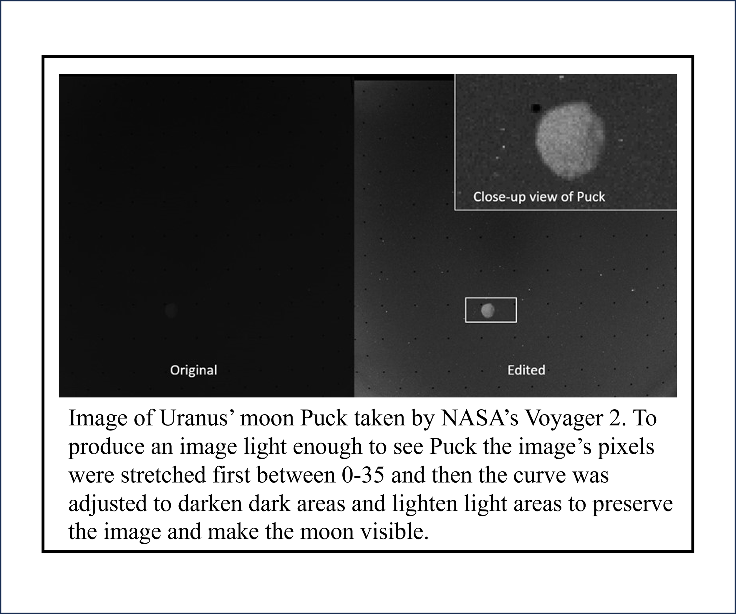
![]()
An image of Uranus’ moon Puck looks like it’s just a black image. The moon is revealed with a histogram stretch followed by a curve to darken the dark areas and lighten the light areas.


Senior Thesis: BS Geophysics
Paleomagnetism and Magnetic Fabrics
-
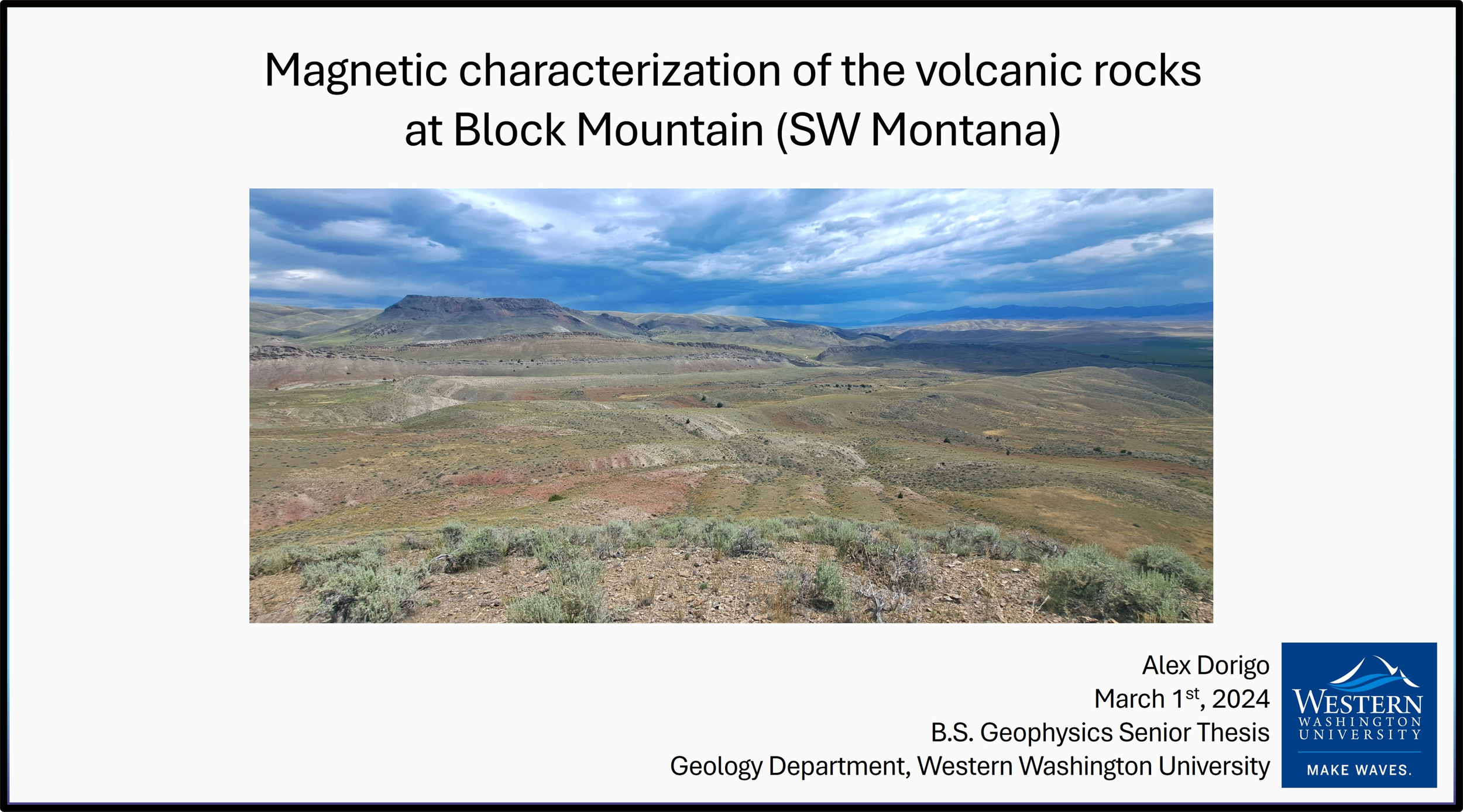
![Title slide for my senior thesis]()
-
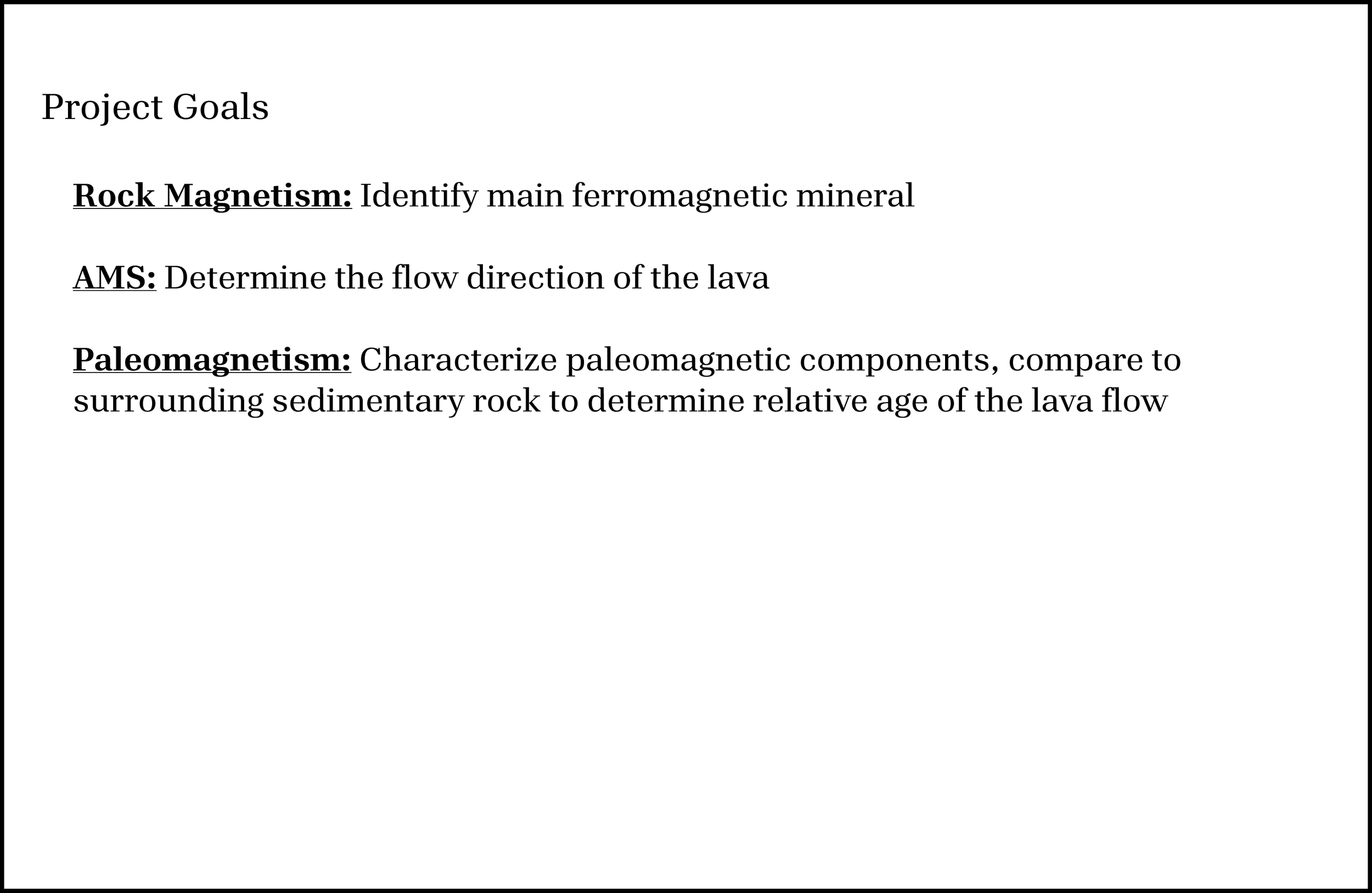
![Project Goals]()
Project goals for my senior thesis
-
![Site age and geologic units map]()
Block Mountain study site locations, geologic units, and geologic age
-
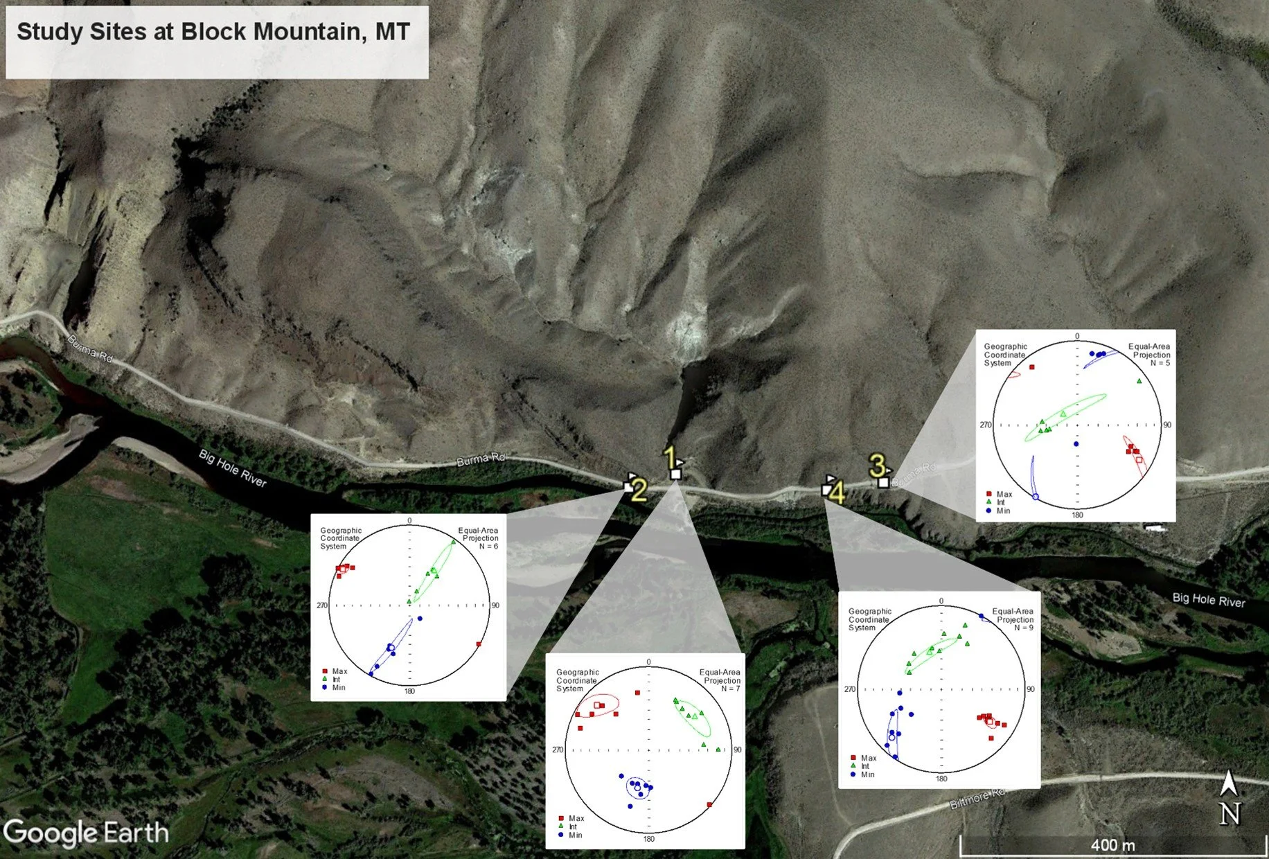
![Map of AMS results at each study site]()
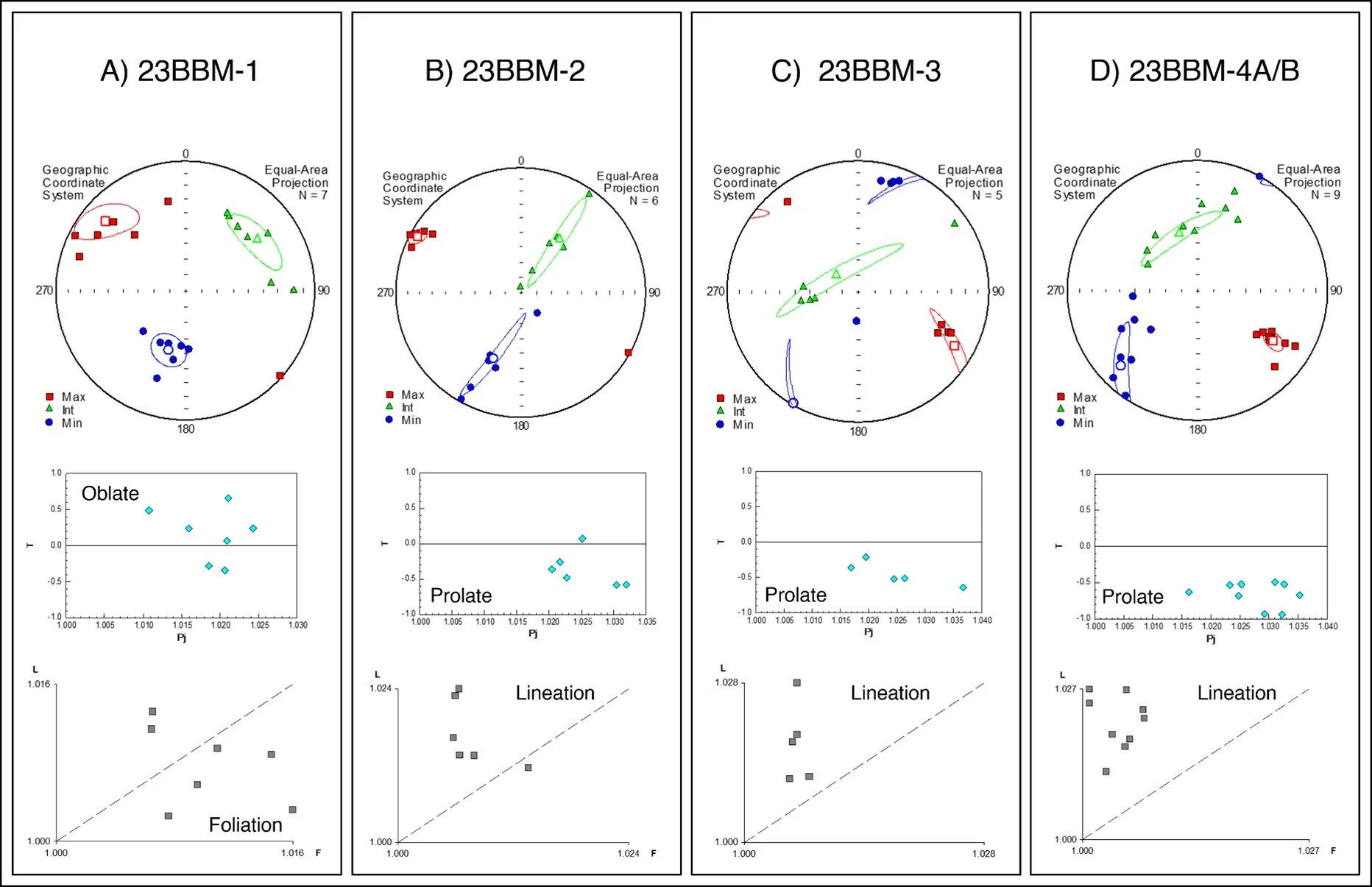
Map of AMS results at each study site.
AMS results visualized with stereonets for each of the five field-oriented blocks. Blocks 4A and 4B were combined as they were both sampled from site 23BBM-4.
-
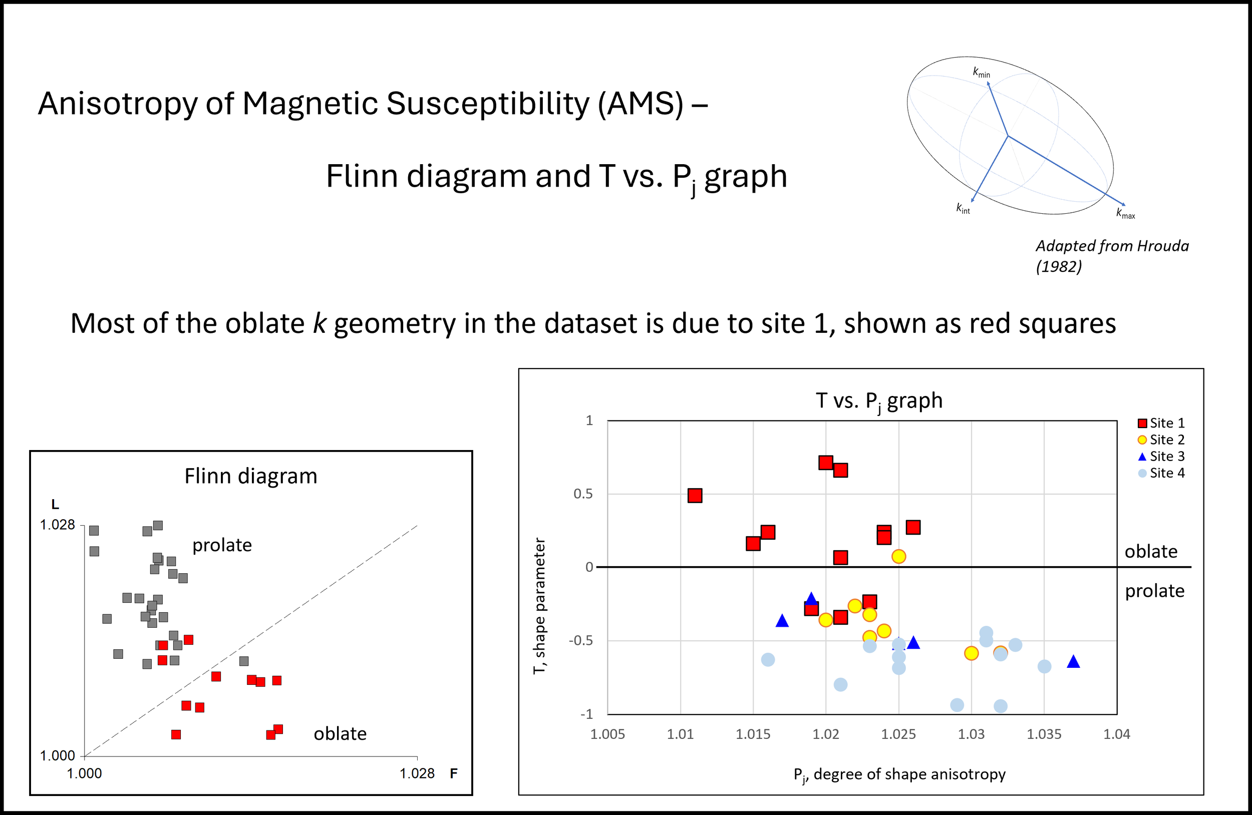
![Flinn diagrams and T vs Pj graphs]()
Graphs showing a Flinn diagram and a T vs. Pj graph visualizing the shape of the magnetic susceptibility ellipsoids in the specimens(Jelínek, 1977), and an adapted Flinn diagram showing the degree of lineation, L, on the y-axis, and foliation, F, on the x-axis.
-
![Stereonets]()
AMS results at Block Mountain, MT. Stereonets represent the 3 principal axes of magnetic susceptibility (k) with kmax shown as a red square, kint as a green triangle, and kmin as a blue circle. Average susceptibility for each axis is marked with a hollow symbol. Confidence ellipses reflect a 95% confidence level of mean axis probability as defined by Jelínek (1977).
-
![Mean k Directions]()
Mean principle axis directions for all specimens, mean k directions, and contour plot showing highest probability of measuring a kmax where contour lines are more dense.
-
![Hysteresis Loops]()
Hysteresis loop (Figure A) and IRM acquisition curve (Figure B) for specimen 23BBM-3-3i, representative of the other samples taken at Block Mountain. Figure A shows a ferromagnetic mineral with low coercivity that remains unsaturated at peak applied field due to presence of paramagnetic minerals. Figure B shows two slopes present: the low coercivity slope is shown with a blue dashed line, the high coercivity slope is shown with a red dashed line.
-
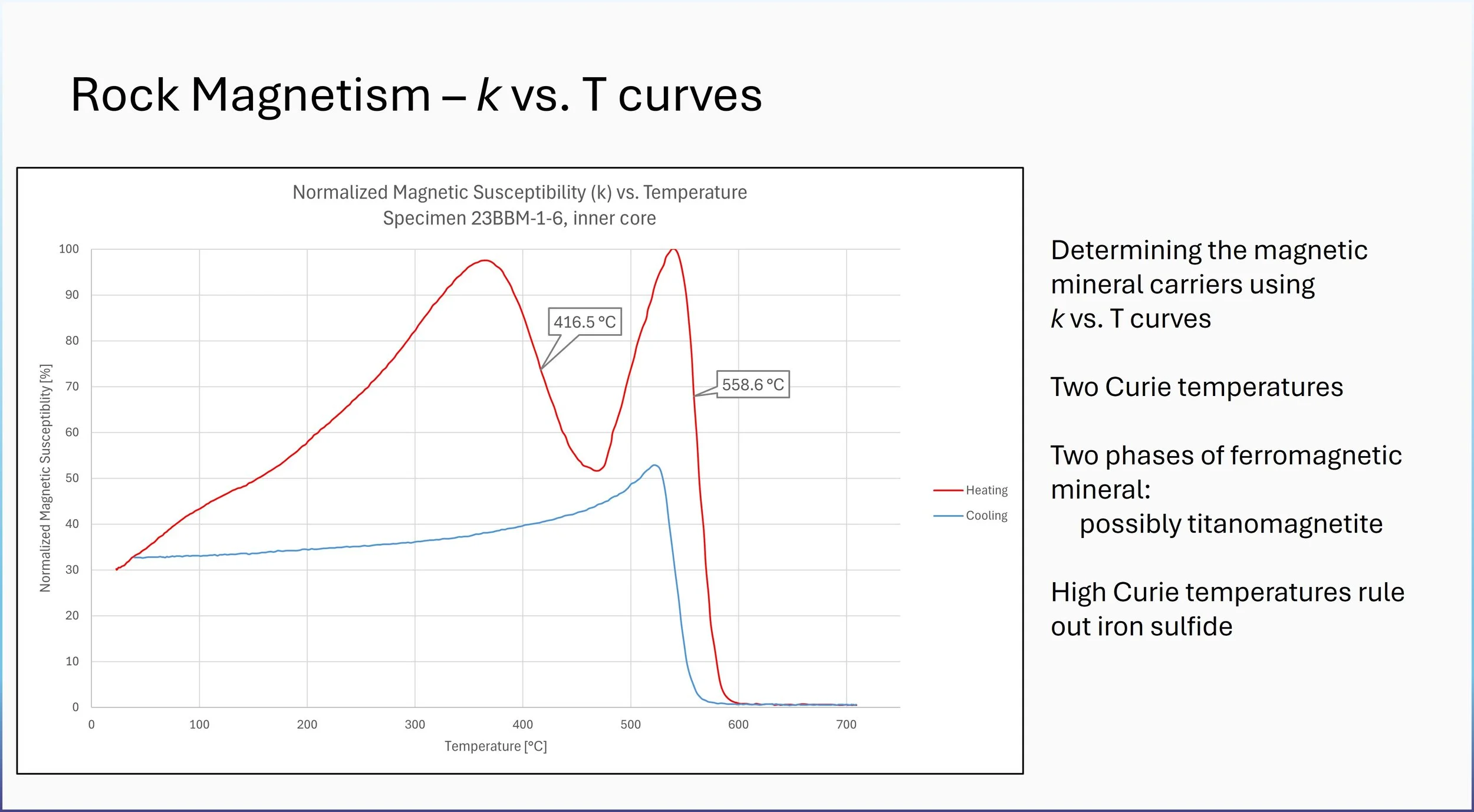
![k vs T slide]()
Magnetic susceptibility versus temperature curves showing Curie temperatures indicated at each inflection point of loss of magnetic susceptibility. The Curie temperatures for specimen 23BBM-1-6 are 417.6°C and 558.4°C.
-
![Component Analysis]()
Final Component Analysis. Component analysis shows component A with a high unblocking temperature (Figure A) and low coercivity (Figure B) as indicated by a red arrow, and component B which has a low unblocking temperature (Figure A) and a high coercivity (Figure B) as indicated by a blue arrow.
-
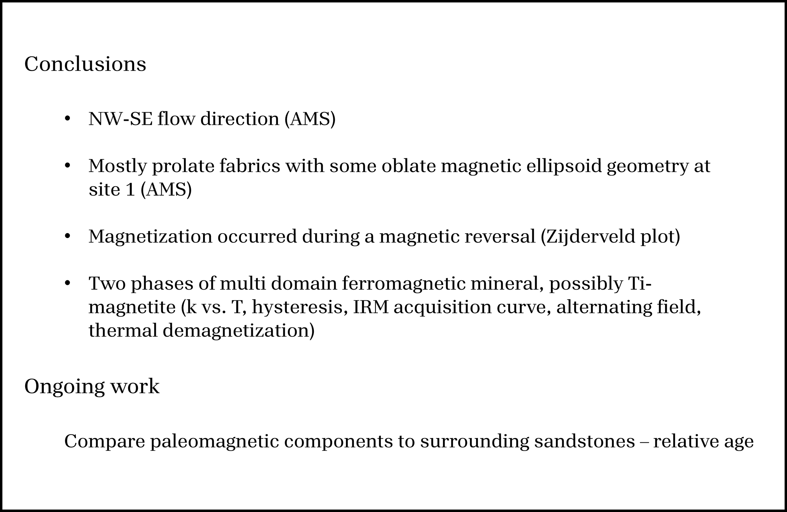
![Final Project Conclusions]()